- Network
- Kubernetes
- Go
Network mapper, I see you!
Learn about the recently developed Otterize network mapper, an open-source tool dedicated to efficiently mapping communication within a Kubernetes cluster by creating functional network maps, focusing on simplicity and effectiveness in revealing pod-to-pod interactions.
Written By
Uri Sarid & Evyatar MegedPublished Date
Jan 20 2024Read Time
8 minutes
In this Article
Recently, we built and released an open-source tool for mapping who’s-talking-to-who in a Kubernetes cluster: the Otterize network mapper. It is designed to do one thing, one thing only, and (hopefully) do it well: create a functional network map of your cluster. This pod (or group of pod replicas) talks to that pod (or group). That’s it.
What does “do it well” mean? It’s minimally invasive and maximally extensive.
Minimally invasive means don’t get in the way of anything else in the cluster, don’t impose any significant load on resources, don’t look at all the traffic or really at anything else not absolutely needed to build that map. Be a very small fly on the wall and build the map as pods communicate with each other. The essence of the approach is not to look at pod-to-pod traffic at all, but rather monitor DNS requests from client pods, as well as looking at already-open connections. For more details, have a look at our previous blog.
At the same time, maximally extensive means to be a great tool in a tool ecosystem, to ensure it is easy to repurpose. First, it’s open source, and independent of any networking or other technologies you might not be using. Second, the map is exportable at any time for whatever purposes you might need: you can list the pod-to-pod comms in a command line. You can pump the JSON format of the map into another tool. Or you can bootstrap intent-based access control (IBAC): converting “discovered intents” (pod A is calling pod B) into client intents files (pod A declares it intends to call pod B) that auto-generate the appropriate access controls (pod B is secured but pod A is authorized to call it). This saves you even having to author client intents files, instead basing them on observed behavior in some representative and safe environment.
But a tool should also be meant for humans, especially one that purports to build a map. Step by step guidance in Google Maps is nice, but without being able to see the map, it wouldn’t be the same, right?
Where, what, and how
So we set about adding visualization capabilities to the network mapper. We first needed to decide where the visualization would be implemented, then what we really wanted out of visualization, and finally how we’d meet those criteria.
Where
The network mapper is actually just a Kubernetes component, with no user-facing elements itself. But it works in conjunction with the Otterize CLI (also OSS under the same license), which calls the network mapper’s local API to reset it, export its map, etc. So the visualization would actually be built into the CLI, not the network mapper itself.
What
First, we established criteria: the network mapper must remain minimally invasive and maximally extensive.
Whatever we used to build the visual map must allow us to stick with the Apache 2 OSS license.
The visualization library needed to be well-understood and adopted so it would stay supported and useful.
Ideally, that library would also be extensible, by passing it different parameters or modifying the source code.
Also ideally, it would be just a visualization library, unburdened by other “cruft”.
How
We chose to use the very popular open-source GraphViz visualizer. Since its input is a simple text-based list of graph nodes and edges, it was easy to prototype without writing any code, just installing GraphViz locally (e.g. brew install graphviz) and using good ol’ Linux CLI tools:
otterize mapper list | \
  awk 'NR==1 { print "digraph G { " } $1 ~ /^[a-z]/ { caller = $1; gsub(/\-/,"_",caller) } \
  $1 ~ /-/ { callee = $2; gsub(/\-/,"_",callee);  print caller " -> " callee } \
  END { print "}" }' | \
  dot -Tsvg > map.svg
Why awk? Why not? Sometimes it’s fun to brush the cobwebs off tools you haven’t used in a long time (or ever?) and see what you can get done.
Eventually, of course, this would be implemented in code as part of the Otterize CLI, and used as follows:
otterize network-mapper visualize [--format=png | --format=svg | --format=jpg] [-n <namespace1>,<namespace2>,...] -o <path>
Building the visualization
We played with it a bit more and soon enough felt confident to jump into actual implementation, in Go (like the rest of our CLI), using the go-graphviz library.
Here are a few things we found as we implemented it. First, the basic examples in the GitHub page for go-graphviz pretty much covered our use case completely. As you’d expect, you create a graph, add nodes (our services), connect them with edges (when one service has been discovered to call the other), and render it as an image.
You do get to choose from plenty (eight) different layout algorithms, and a seemingly endless world of possible configuration options for various aspects of the graph. We went with the default layout algorithm, dot, and only changed one option: rather than a top-to-bottom flow, we went with a left-to-right flow. That just seemed to make more sense for a functional network map.
When the CLI queries the network mapper API for the network map, the result is a set of “discovered intents”, as explained in the introduction: service A in namespace X has been calling service B in namespace Y. To build the graph in code from this result, we first parse the intents to extract all the services, adding them as unique graph nodes labeled by service-name.service-namespace. We then iterate over the intents again, and this time for each intent we create an edge between the source node and the target node. After a bit more format-specific work, we render the image in the appropriate format to the output and we’re done!
Output formats
GraphViz is pretty versatile, and supports multiple output formats. We chose to support three of them, which you can choose through the --format flag. Each has its pros and cons, but together we felt that most use cases would be covered. If yours isn’t – well, this is open source, you know what to do!
PNG
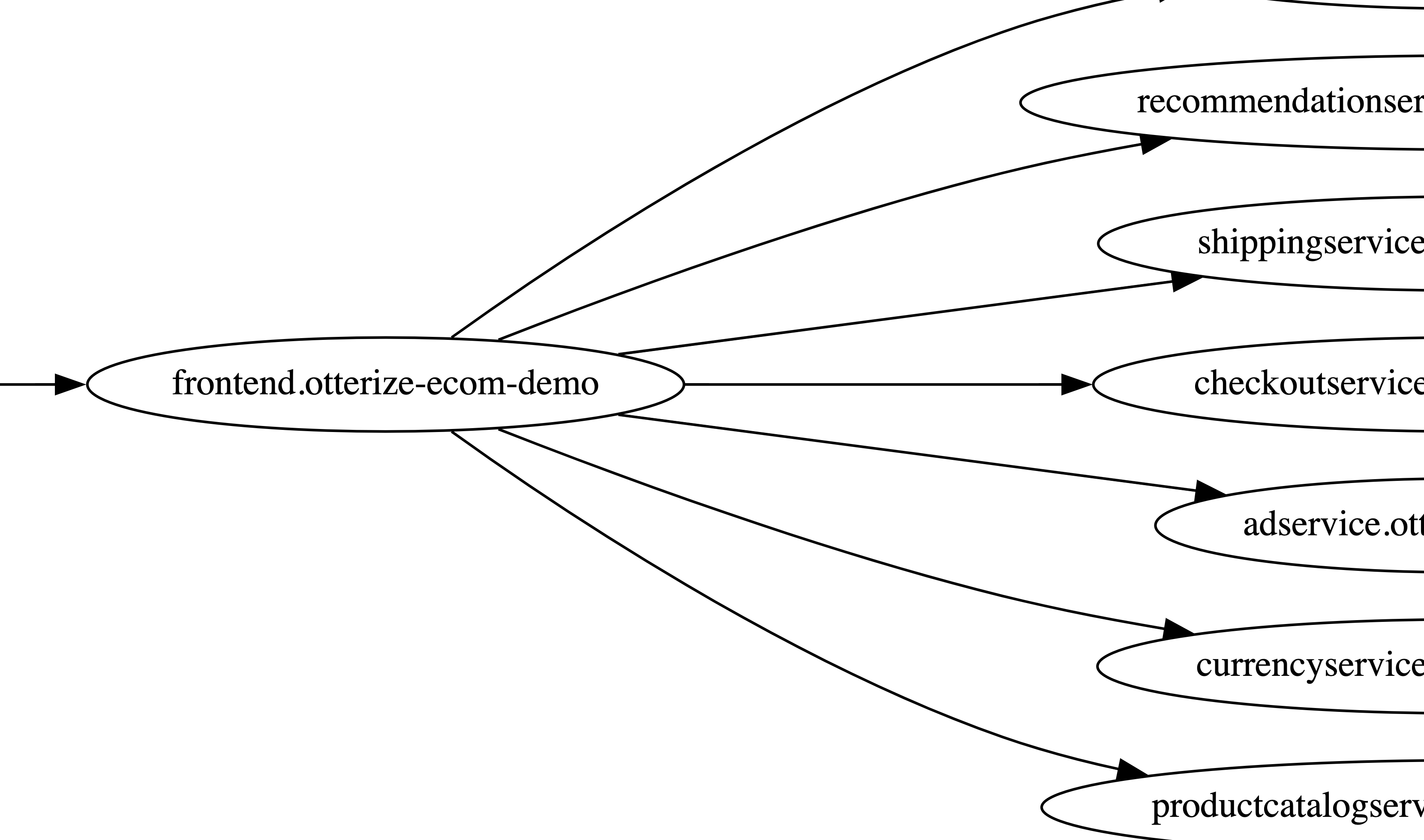
The obvious one to us, which we chose to be the default, was PNG. It’s designed for shapes (vs photos) so sharp lines and text don’t have too many artifacts when they’re rasterized and compressed, it supports transparency, and most importantly, it’s effectively ubiquitous. That makes it easy to reuse the visual map in many ways, which is important for our “maximally extensive” principle. Here’s an example of a generated network map image from one of our tutorials, showing the services in the Google microservices demo running in a Kubernetes cluster:
otterize network-mapper visualize -o demo.png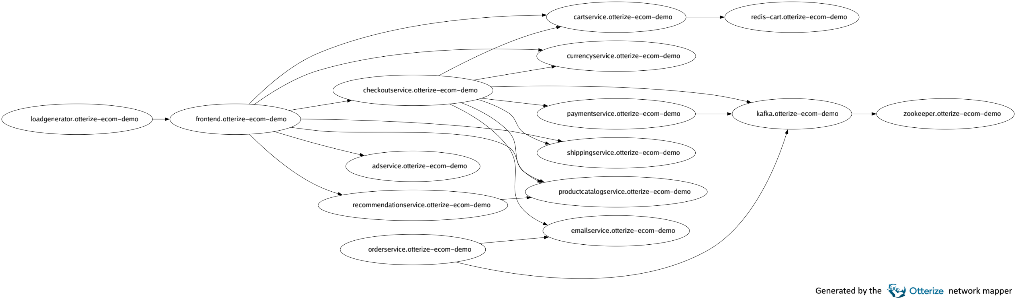
JPG
JPG uses a different, lossy compression algorithm vs PNG, more optimized for photos than for shapes with sharp edges. And it doesn’t support transparency. But it is even more common than PNG, it results in somewhat smaller files, and the slightly worse pixelation-type artifacts may be acceptable in some cases. So it’s an option.
SVG
While PNG and SVG have their advantages, they also have their drawbacks. They’re pixel (raster) formats, so they can look… pixelated. We output a high-resolution image, to minimize pixelation, but the result can be a pretty large file, if there are numerous services. So in some cases a vector format is preferred.
Fortunately GraphViz also supports SVG, which is quite familiar and supported on all major browsers, though not quite as supported in other tools. SVG files produced by GraphViz are tiny, and of course infinitely scalable and lossless. Since SVG is a text-based, vector format, it’s easy to zoom into the map at any resolution, extract parts of it if needed (even just take screenshots of what you want), or easily modify the SVG file itself to suit your needs. For example, you might automatically extract snapshots of your cluster as SVGs, even if there are numerous services in it, and distribute them to the teams using the cluster; each can zoom into the parts relevant for them, and use that as they please, e.g. when creating slides for a presentation, without worrying that their slides will look grainy.
Now available
The network mapper visualization capability is now available within the Otterize CLI. The docs include the command reference for using it, though you can always just type otterize network-mapper visualize -help.
It’s easy enough to just install the network mapper in your cluster (it runs locally and stores its data locally), install the CLI on your laptop, make sure some traffic has happened in your cluster, and run:
otterize network-mapper visualize -o my-cluster-map.png
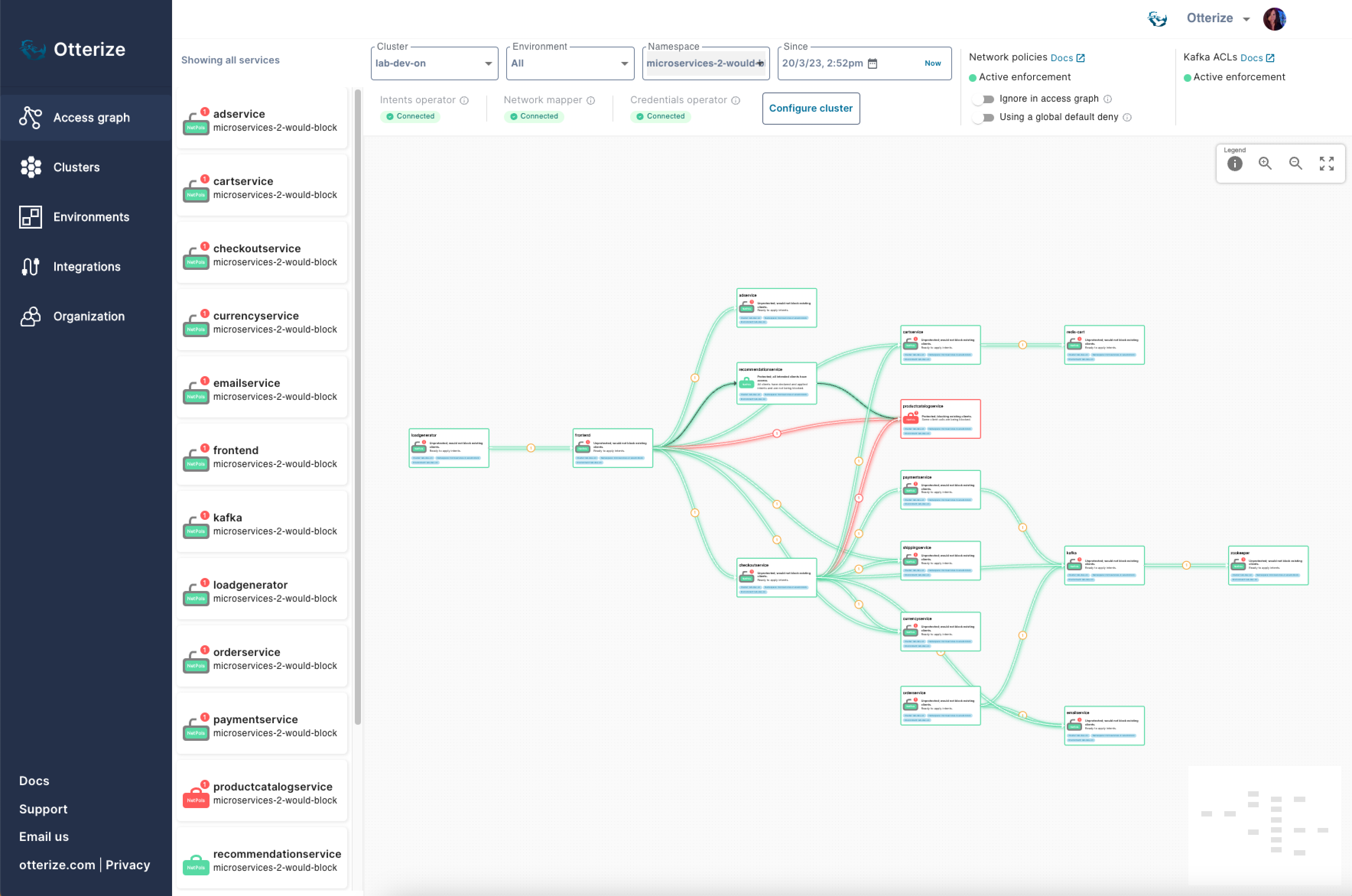
This visualization, of course, is of one thing, and one thing only: which pods called (or tried to call) which pods since the network mapper started. You can see the bigger picture (multiple clusters, filter by environments as well as namespaces, more history) by sending the network mapper information to Otterize Cloud and seeing it in the access graph:
To get started with the network mapper, including this new visualization, just head on over to the quick tutorial in the docs.
So, the only question that remains is: do you know who your services are talking to tonight?
In this Article
Like this article?
Sign up for newsletter updates
Resource Library
Read blogs by Otis, run self-paced labs that teach you how to use Otterize in your browser, or read mentions of Otterize in the media.
- Kubernetes
New year, new features
We have some exciting announcements for the new year! New features for both security and platform teams, usability improvements, performance improvements, and more! All of the features that have been introduced recently, in one digest.
- Kubernetes
First Person Platform E04 - Ian Evans on security as an enabler for financial institutions
The fourth episode of First Person Platform, a podcast: platform engineers and security practitioners nerd out with Ori Shoshan on access controls, Kubernetes, and platform engineering.